Case Study: Coral Order E-commerce Site
by
Rondesign


About
A few months ago one of our regular clients for whom we have already made several successful projects applied to us again. He needed a redesign of his major project.
Begin
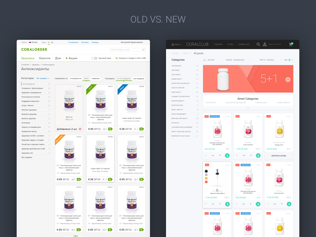
The decision to do the redesign of an e-commerce and change the design concept was due to the fact that the site did not meet the current web standards and its goals.
In addition, the access to the website was private, but it was decided to make it public.
About the project
Coral Club is an offline club for people using the products of this brand. Originally, the website was intended only for the offline club clients. A little later the concept was changed and it became a complete e-commerce.
Currently the website sells health, beauty and domestic products. Mostly the range of products is presented by all sorts of supplements and vitamins that help to feel better.
Discovery
We had an extremely short discovery, because the customer had a whole army of developers, designers and marketing specialists who were monitoring the site around the clock and knew all its problems and shortcomings.
We were kindly provided with the comprehensive project data, such as:
• main problems of the current version of the website
• WebVisor Metrica
• data of the opinion poll among the clients
• feedbacks from regular clients
• links on competitors’ sites
• a detailed brief with the client requirements
We had only to study the data and make the product that solves all the problems meeting the goals of the project.
Basic issues
1.Website doesn’t sell.
Once the site was given public access, the customer using Metrica and call center found out that users who come not upon recommendation, do not buy anything.
2. The products are unclear for the users.
New members who came to the site through the search did not understand the specifics of the products and what they needed to buy.
3. The products are bought only upon recommendations.
It was found that users that buy goods, choose them exceptionally upon the recommendations. In practice users actually buy products offline and the site in its turn serves as a platform for placing an order selected in advance. It was a great discovery for the customer as he thought that some users did bought goods online.
4. Non-responsive web site.
Almost 40% of users visit website from mobile devices.
Details
During the negotiations with the customer it was unanimously accepted to make design in the Material. This decision was based on the fact that Google has detailed guides that make it easier to maintain and improve the e-commerce. Material is easy to adapt, and it has a lot of source materials in the form of icons, colors, fonts, scripts and source code.
Based on 3 key pages of the web site we will tell you in details about the features of this project. All pages of the project can be viewed at the link on the Dribbble.
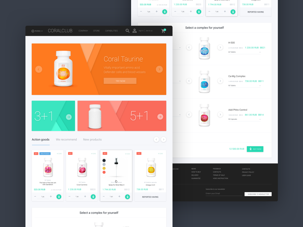
As new users have almost no idea about the products, we have prepared a list of solutions that can help them better navigate the site.
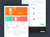
One of these decisions was to make a block with the complexes chosen in advance on the main page and on the product page, which will help users understand the type of products needed and make a purchase quite fast.
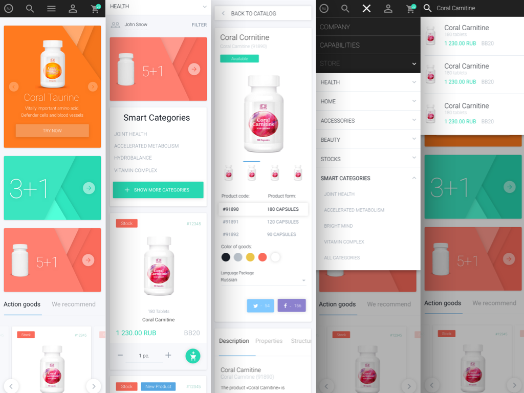
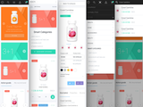
Main navigation
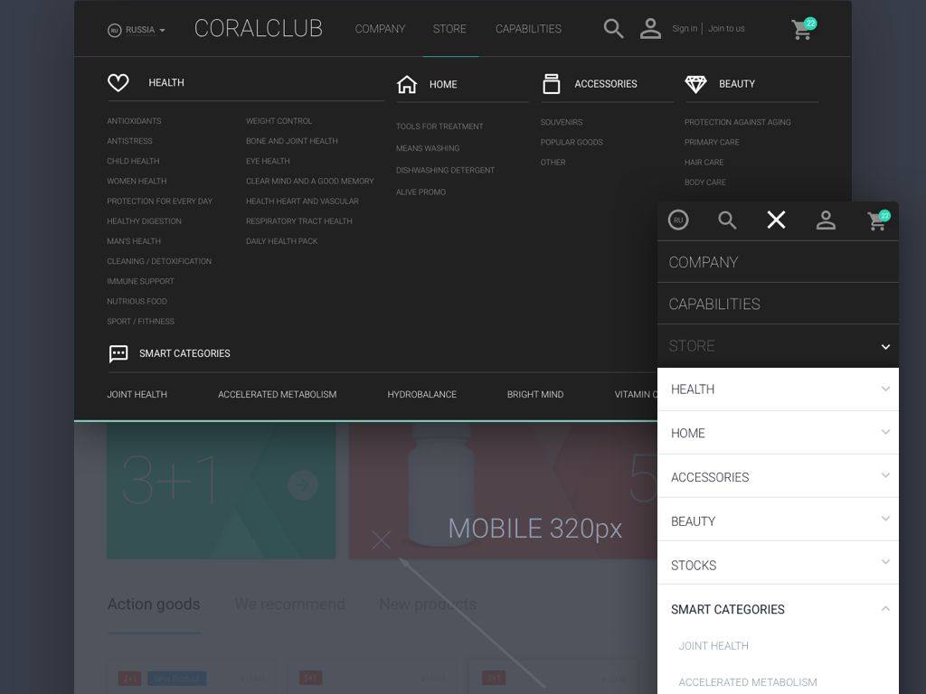
One of the main tasks was to hide and make the navigation easier, as on the current site it took a lot of useful space.
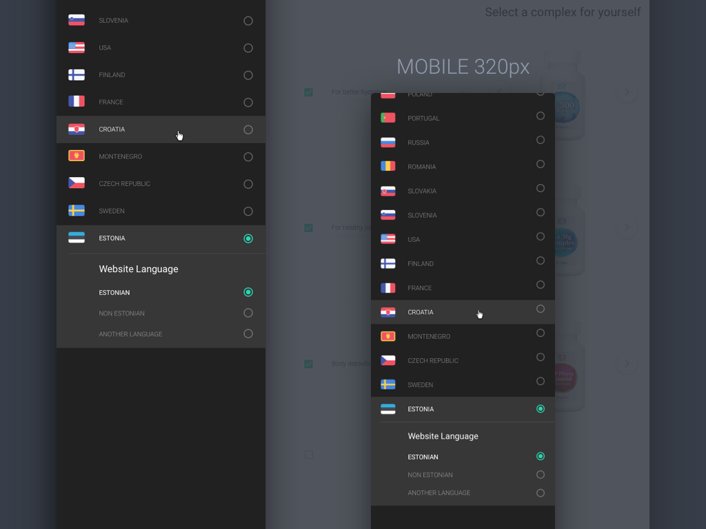
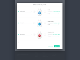
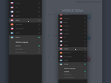
The first problem that had to be solved was that Coral Club had branches in 35 countries and all users were using the same web site. Also it was necessary to take into account that each country may speak several languages. So, it was necessary to make a selector on 35 countries in which you could choose a page and language and have a quick access to it to change the settings.
Another problem was that having a small quantity of goods online the website provided too many categories. The customer was going to expand its product range, which also had to be taken into account.
The menu also provided “Smart categories” for inexperienced users to make the navigation on the site easier as possible.
We decided to test the situation in which you can view and change the number of products on any page.
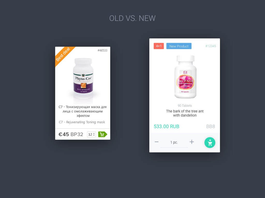
Product details
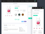
Compared to the previous version we believe we managed to add more information and didn’t lose at the same time at comprehension and general form :)
Now you can enter multiple tags in the new card and there has also appeared a dosage for preparations. While the structure and the number of blocks on one page remained the same, the new card now has more space and is easier to read.
We tried to make the information in the product card clearer and more understandable for the inexperienced users. Similarly, we didn’t forget about the complex order :)
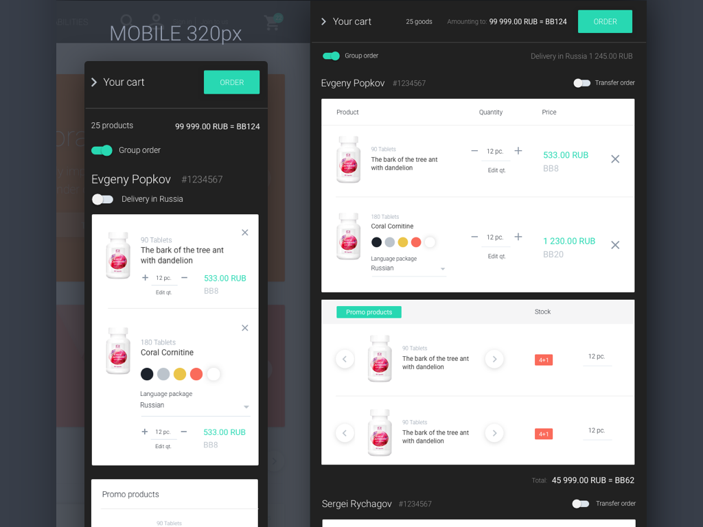
Responsiveness
One of the most important factors to make a responsive design was the fact that almost half of the users get to the site from mobile devices. The design was decided to be made for minimum width of 320px. During the development of responsive web pages we managed to make the same functionality as in the web version.
Conclusion
After the e-commerce concept was made, we sent all the materials to the customer. After the design was approved, the next step was cooperation with the development department. Now we are helping the development department in the implementation of our design, answer their questions, as well as act as front-end testers, looking for bugs and sending them to the bug list.
The next step will be testing a new design by client’s users. Since the product design always implies improvements, we are always thinking about how to improve the product and offer new ideas for the project.
P.S. Before preparing this case we have collected and discovered more than 30 cases and tried to make it interesting for you. We have been preparing it for a long time and would like to hear your feedback in the comments or in any form convenient for you.
You can also find our team on social networks: