HelloHome Case Study (Tinder UI App)
by
Rondesign


About
HelloHome is an application for neighbors searching created to be similar to the Tinder UI model.
There is an outstanding issue on the market about a qualitative way of searching the neighbours that has appeared long ago, however still hasn’t been solved as appropriate.
Problems
There is a sufficient number of applications, services and web sites, but they all have
a lot of problems in common:
The main problems in this area were and still are the following:
1. Small niche, low range of market offers;
2. As a general rule, the search for a neighbor is a lottery, you never know what kind of person you will bump into until you just communicate or live with him personally. This problem significantly stretches the time of search.
In the application HelloHome we tried to solve these basic problems.
Issues that the app solves
There is a sufficient number of applications, services and web sites, but they all have
a lot of problems in common:
a small number of profiles;
profiles contain little information about the owners;
services look more like bulletin boards than people search services;
an advanced search that does not save user requests;
the problem of communication, usually the services don’t have instant messengers implemented;
the need to constantly be on the lookout;
the absence of notifications of new and appropriate profiles.
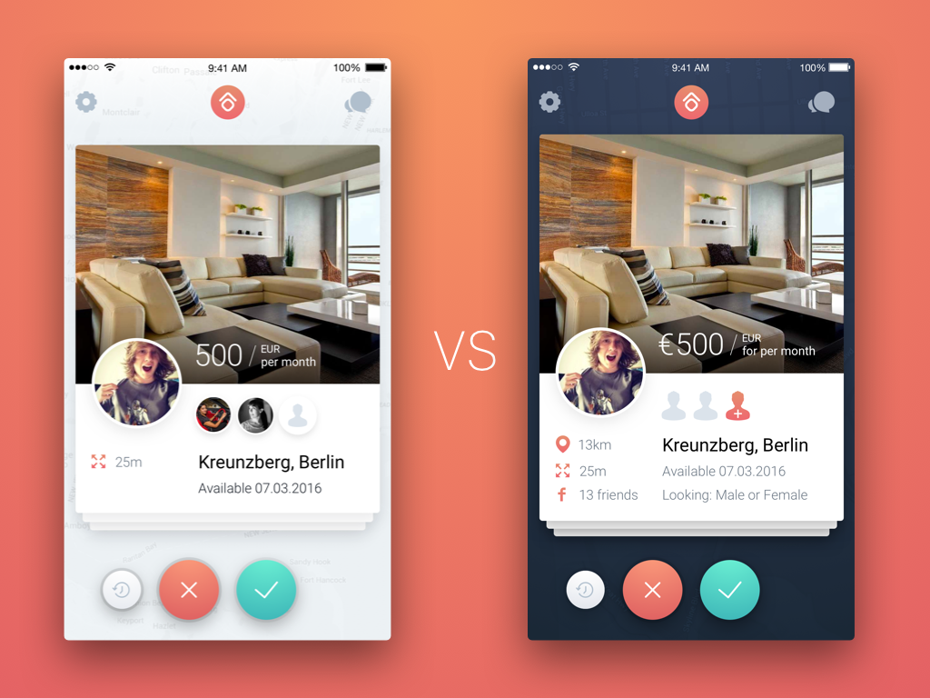
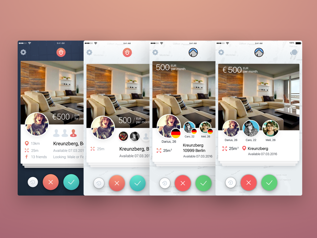
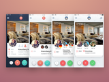
To solve most of these problems, we created an application in which we combined two models, a standard housing search model and a gaining worldwide popularity Tinder dating application model, in which all of the profiles are designed as cards. This helped us to solve several problems at once:
as far as there are always not many appropriate profiles we did so, that a user could see them all. In addition, profiles are displayed as cards at a time just like on Tinder;
once you enter the search, the app will always look for suitable forms;
profiles are quite detailed enough to get the first impression of a person;
a
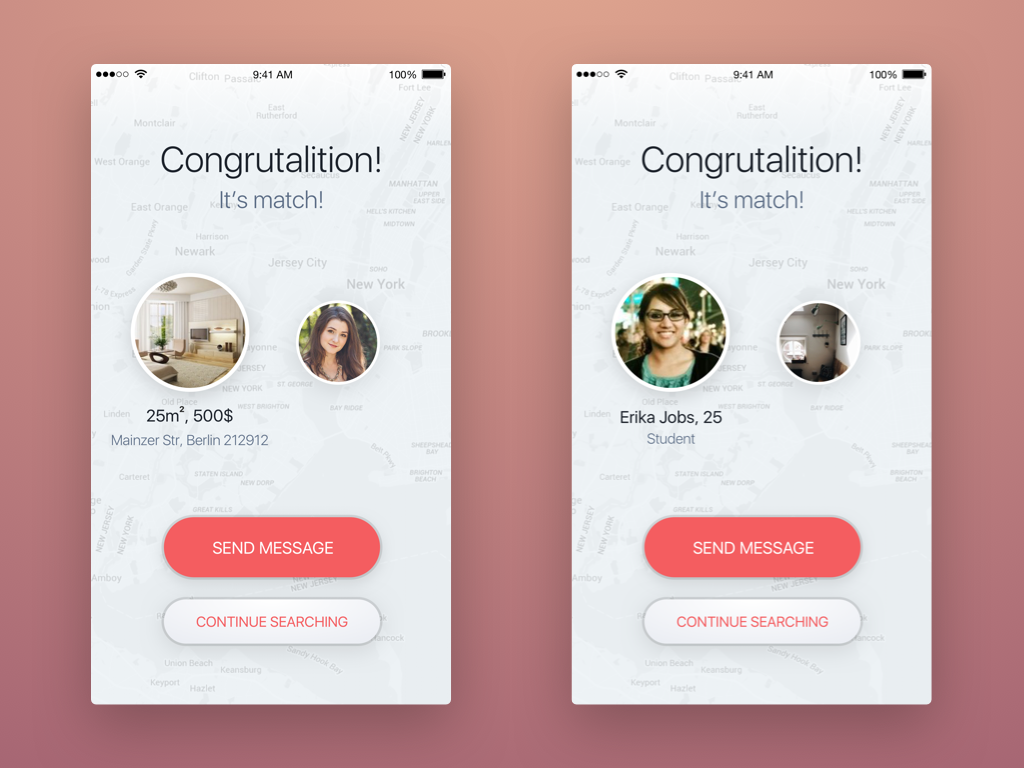
user can chat with all suitable candidates briefly via messenger and make a decision, which will be sufficient to meet and mingle in life;
the application will notify you about new profiles, or profiles relevant to your search.
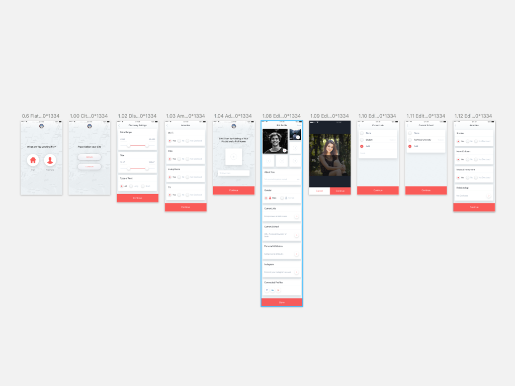
Application structure
The application consists of two types of users, people looking for apartment and apartment owners and people looking for a neighbor. Accordingly HelloHome had to make two types of profiles, unlike Tinder that has only one type of profiles for all users. These factors had to be taken into account when designing an application. During the architecting process we tried to consider all the details, you can see it in the prototype on Invisionapp.
Architecture
Unfortunately, in this project, we did not make a full-fledged prototype on Flinto or Pixate, so it was important for us to work out the details in quality with invisionapp. It was needed that the common logic of the application had to be clear even without the dynamics and the small scenarios designed.
Application features
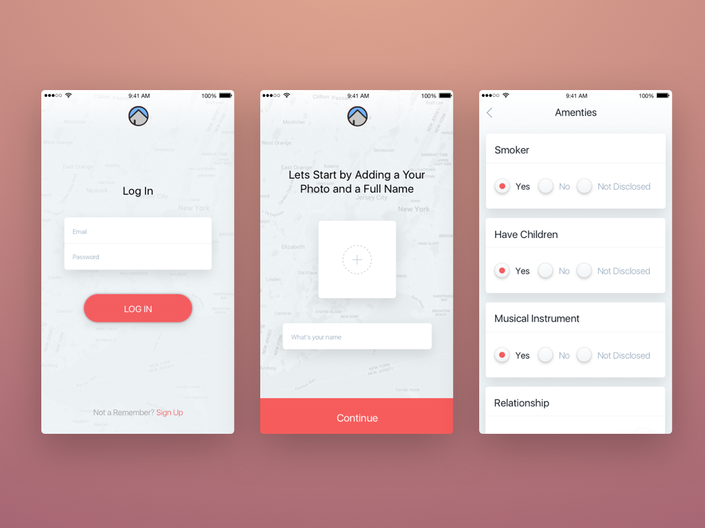
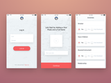
1. On the step of working out the architecture we made a chain of sign up screens, due to the fact that we decided not to make long forms, but make small steps in which the information input doesn’t require the use of the keyboard. After testing a few variants by the close friends in Lookback the current version appeared to be the most effective one.
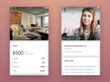
2. Several times on the stage of architecture and design the apartment profile page was redesigned and implemented.
Design
It was decided to make a unique design that would be memorable and would be associated with this application. We had to do something different, and that the design did not look the same as Tinder. The reason for such a decision was that the style of the application has to stick in users’ minds, and if a user shares the application with friends, briefly it has to sound something like, “It’s like Tinder only for searching the neighbors.” We also decided to slightly withdraw from the guidelines.
Long Shadow
We used the Long Shadow in design, because this style gives the most complete idea of controls and navigation, the understanding where to tap, and where the clickable elements and zones are.
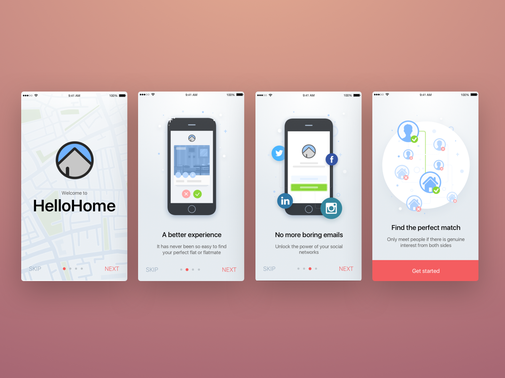
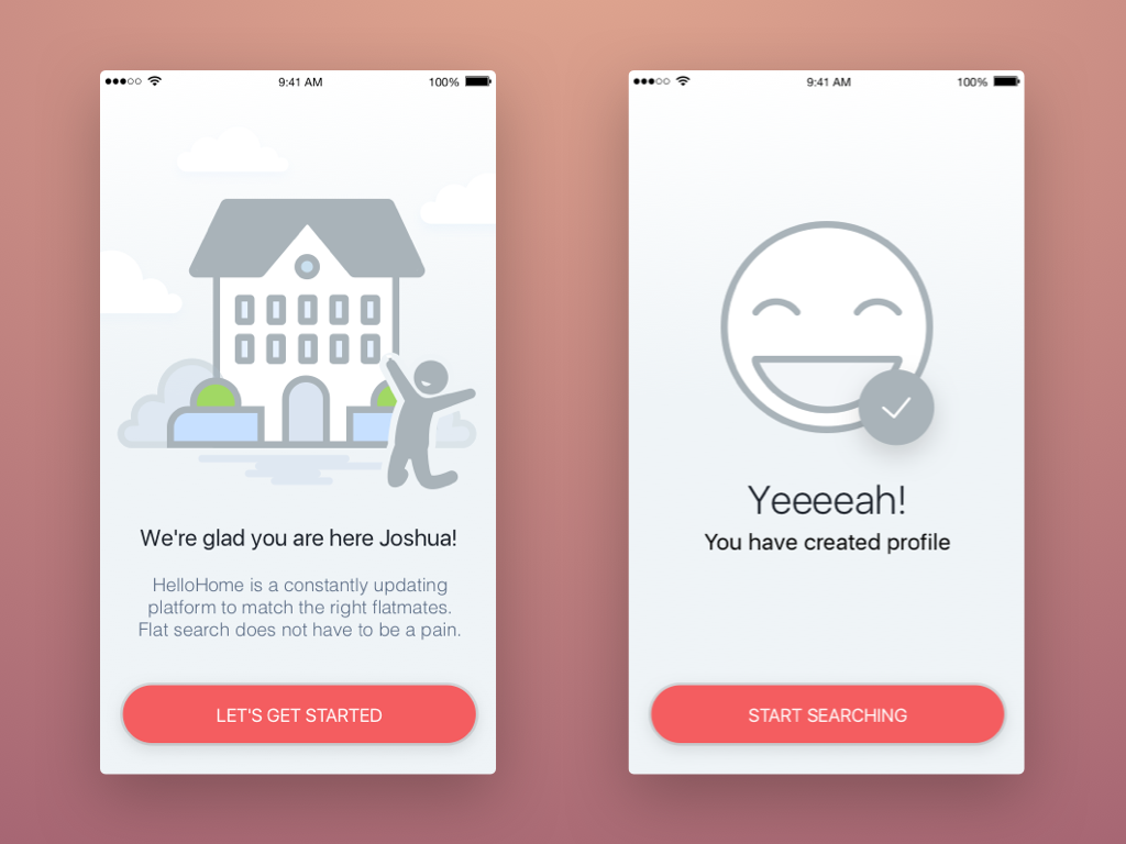
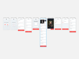
Chain of sign up screens
As we have mentioned before, we made a long chain of sign up screens.
Screenshot of chain of sign up screens
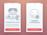
So that a user didn’t get annoyed about signing up we added a few more screens in the form
of Tour Screens :)
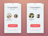
That would give a final goal and a few Success Screens to keep up the spirit.
Unfortunately, for now we can’t say how effective this decision is, but the testing will show and we will be able to fix this moment already in the second version.
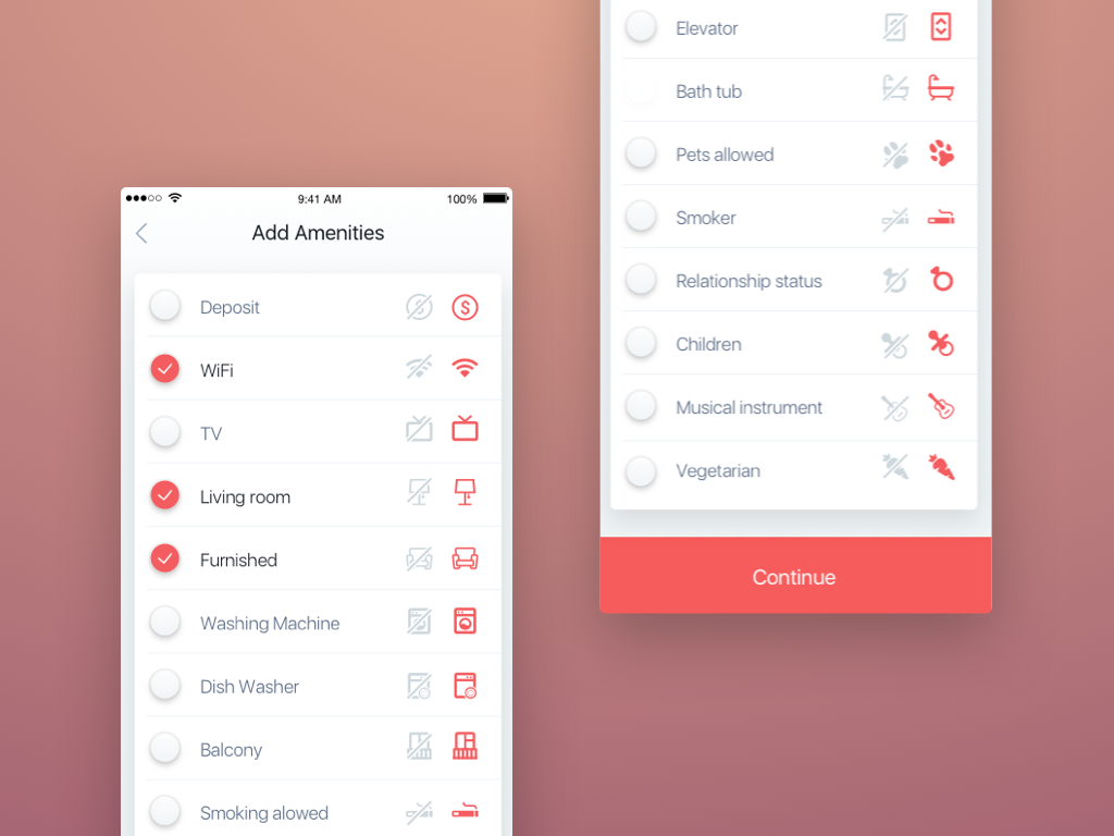
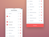
Amenities
As long as the customer knew a lot of information about his future users, he helped us to make out a detailed list of amenities for the profiles.
Conclusion
Initially, we supposed to make 8 screens, subsequently the app has grown up to 53.
Actually, you can see what we finally got in our project on Invisionapp and on Dribbble. Also you can download app on iTunes.
Now the project is under construction in the developers department and as soon as it is ready we will announce it on our account on Twitter and Facebook.
We will be glad to hear from you a feedback :)